Monday, August 23, 2010
I lied
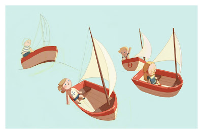
nope, just couldn't leave it alone, after the weekend i realised prefered it when the boats were closer together and i felt it needed one other little element. At first i had a whole flock of seagulls, then one by one they were erased until this little fella was left. I think the picture needed contrast and the seagulls gave me that in scale, the flying ones proved too much contrast though as they were in the air, something else for the eye to consider. Happier with it now... for now!
Friday, August 20, 2010
Tree
NCT Boat Race
Wednesday, August 18, 2010
Colour added
wohoo had a whole hour to do what I wanted today! I managed to get the first pass of colour down, I want to keep it light and simple I find it more charming that way, and its satisfying to break some old game industry habits of adding lots of ambient occlusion and dark shadows to give soemthing form.
Monday, August 16, 2010
Thursday, August 12, 2010
Boat Race is Underway
Ok so I took that thumbnail from my last post that I was happy with and broke it down into a box with easily re-created landmarks for all the curves of the boat. I can go ahead and rotate it into any angle and make the boats seem like they are riding the waves. Hopefully this will be enough and I can get away without having to paint the water in as that will be a royal pain in the arse. hmmm maybe that means I should try and do it then, agh damn it!
Wednesday, August 11, 2010
Getting it right
Dilly's bike picture isn't going anywhere, not surprising really it started off as an example to show the publishers of a kid on a bike do I've put that on hold, might come back to it later. So last night I started on an Idea Ive wanted to do for Dillon and the NCT kids for a while, they're all off to school soon so I wanted to do a picture of them all going off on their own little adventures. I struggled with the boats for a while though and this was the best sketch. However I realised I was guessing at angles and shapes again. This time however I stopped as soon as I realised to try and work out a simple form I could rotate into loads of angles. A big part of being a decent draftsman Ive recently been taught is to be honest with yourself if something isn't looking right, it's taken me a while to get though.
so here's a more simplified boat shape, I wanted the proportions to be cute and the shape to be easy to read, the fact that it doesn't mimic a real world boat shape doesn't matter, it needs to be naive and endearing. The fact that this also makes it easier to rotate in 3d space is a bonus! I'd say the top sketch and the bottom left and right ones are the best
Subscribe to:
Posts (Atom)